Edit: Maybe I’ve should have started with this: I have only used it for different SubGHz and Infrared dumps. Not at RFID. But I do think the file is build very similar.
EDIT 2
A lot of writing for nothing. Now I have also a RAW RFID Dump … Much more work, than expected.
Sounds awesome. But I do think this set is skill is not very common. Have an eye for ‘RAW Data’, is able to programming and knows how to bring this together in a visualization … at least.
I, as example, am pretty good trained in data analysis. From Fortran over R to SQL (also MS SQL BI things). I know a little python, but not as much as I can paint something.
I’ve found this project and modified it for different purposes:
Even if this is not a perfect ‘give something raw in and get something useful out’ it may help others to start, as well.
Usage:
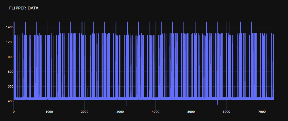
python3 -BO plotall.py some_file.sub --outfile some_bars.html
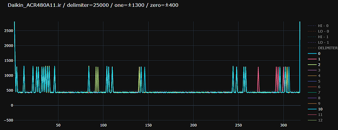
Now we should have a delimiter (where are breakes in the sequence?), and two altering values. Lets say the lower is 0 and the higher is 1.
In my last project the ‘delimiter’ was roundabout 20000 (a value, that starts every keypress). The higher value was roundabout 1300 and the lower something roundabout 450.
The next command is:
python3 -BO plot_delimiter.py some_file.sub --delimiter 25000 --one 1300 --zero 450 --outfile a_nice_signal.htm

(Nice feature: With clicking on the datapoints at the right side, you are able to set/unset it. For example to compare two data direct in a set of 12, without regenerate every time.)
At the second command the console output is interesting, as well. Good to load into an excel sheet or database for further compares.
This is just the start for me. I hope there will be a better/more explaining how to following, some day 
I really want to change the names with the names form the file… This costs me at least 3 days without success, right now. If anybody is better in python-plotly than me 


 , but at least it is back.